abstract, art, background
MOTION GRAPHICS

ILLUSTRATOR

AFTER EFFECTS

PREMIER PRO

PHOTOSHOP

Figma - Design

First impressions since I started using Figma:
– Feels quite intuitive, especially you have had some experience with Illustrator.

– Fairly easy way to design prototypes for websites and even for apps (mobile)

For this infographic, I downloaded the background from https://www.freepik.com/, and SVG files from https://lnkd.in/ezJG2AWM

– Amazing thing about SVG files is that you have the autonomy to redesign the icons and their parts separately.

If you have not yet given it a go, go ahead and try it out. It will open up a whole new world for you.

Differences

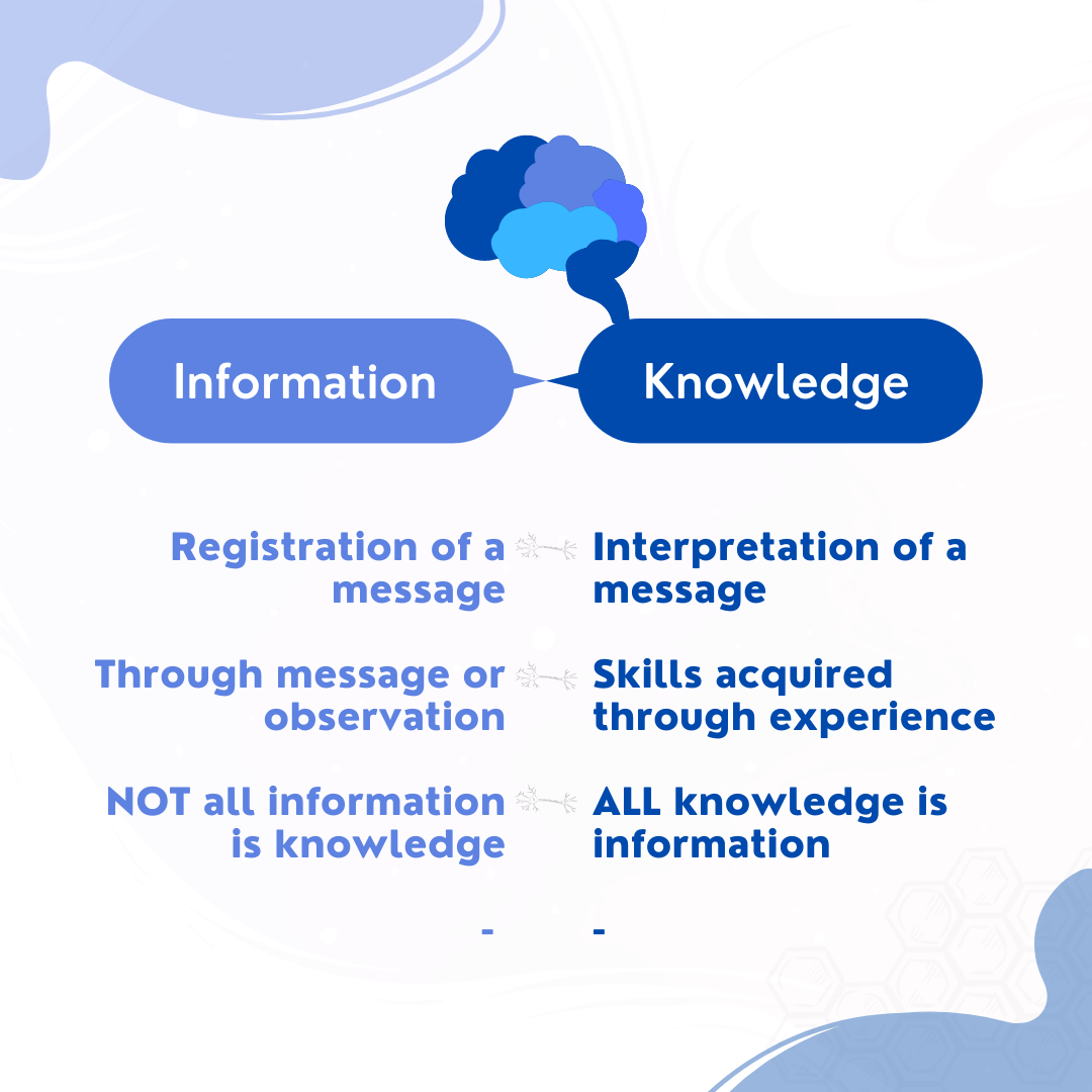
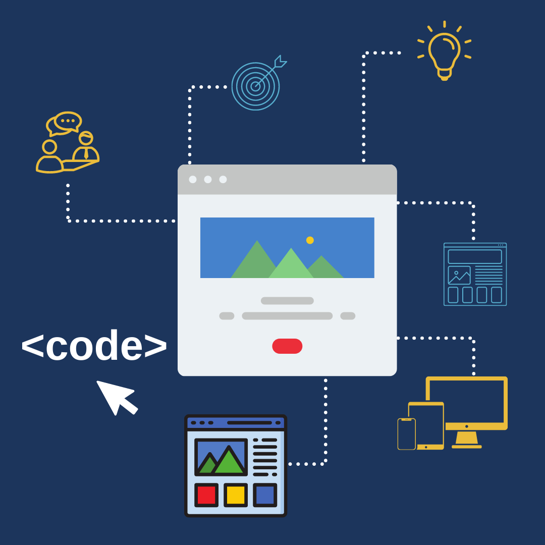
We are learning new things every day, but we often catch ourselves thinking, “I have seen this before…”. Thus, that means we are not registering the info received.

I have decided to bring my thoughts into this infographic to make it more visual and easier to understand the differences between Information and Knowledge.

Thought Process behind this infographic.

Colour:

Blue – We all know that the blue colour symbolizes wisdom and depth of understanding. Different shades of blue, emphasize the importance of one element over the other. Plus, how our brains register information and knowledge.

Graphics:

– Brain

With a variety of shades of blue – since we are talking about how well our brains absorbed information

– Rounded Balloons

Since this can sort of translate the idea of communication in general. (conversation or thought)

– Waves

Dreamy (inside the complexity of neuron transmissions)

– Neurons

To connect information from both sides, since that is what neurons do. (transmit from cell to cell)

#infographics #knowledgeispower #graphicdesign

Bad Design Can Cause...

This infographic represents the feelings it can cause to the users, if your interface is poorly designed.

A range of specific colours were picked here to be represented, respectively: {On Canva}

– Yellow (Top & Bottom) for attention;

– Blue to represent sadness;

– Purple to represent loathing;

– Dark Pink to represent rage;

– Brown to represent heavy feelings.

Extra:

Fonts: Exo and Open Sauce (similar enough to keep consistency)

Negative Space: To keep it simple and effective.

Web Design - Process

Here I show step by step how to kick off a Web Design Process. 

The thought process for this infographic:

  • Extract info from a YouTube video (by taking notes) 

For Inspiration

  • Look for colour, elements, and fonts related to the topic (in this case TECH)
  • Choose one style of Infographic

! Start putting it together.

Build on Canva 

___

Steps:

1 – Understand your client;

2 – What the goals are;

3 – Ask what they Do & Don’t like;

4 – Wireframe (Sketch ideas)

5 – Mockup (look and feel) of all possibilities

6 – Prototype

7 – HTML/CSS/JS for Coding

Step By Step - UX

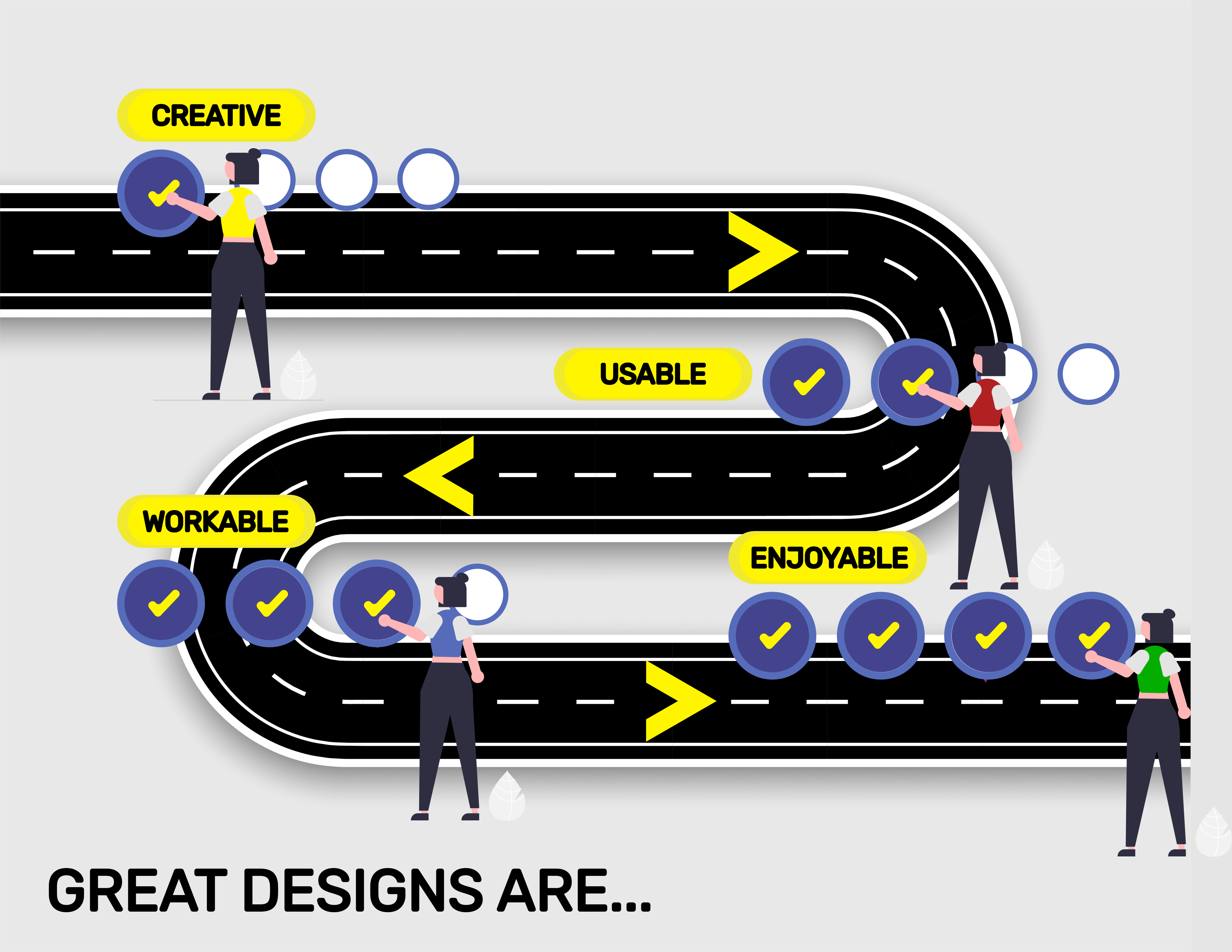
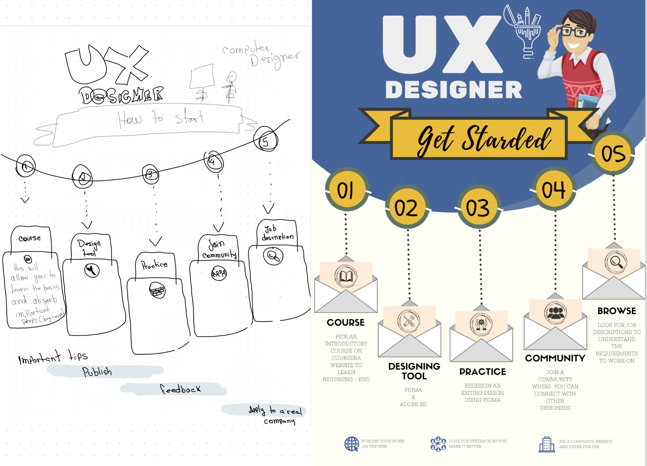
Here I show the whole step by step on “How to get started on UX Design”

First, I watched a video on YouTube and took notes of the exact steps to take.

After gathering all the relevant points about the topic, I went on to look at the possibilities to approach my design. Then, started sketching snippets of what I thought would fit best for this material.

My thoughts on this infographic were mainly to make it interesting and informative, but not overwhelming.

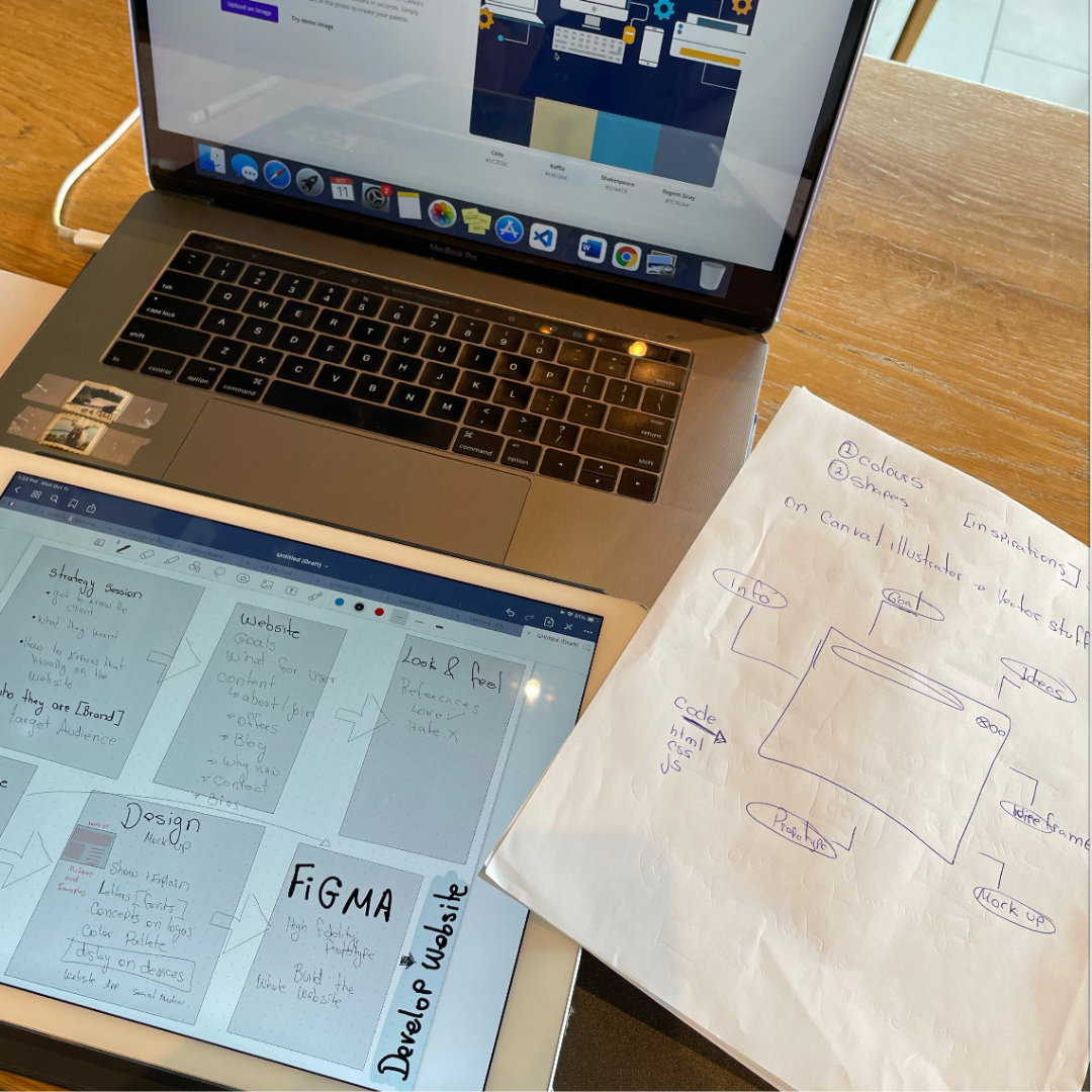
Once I had my initial ideas on the paper, I started by creating two canvas on CANVA:
Canva N.1 for the actual Design
Canva N.2 for playing with graphics and letter

That guaranteed me that I wouldn’t mess up my whole design at any given point.

I learned that you don’t need to have the greatest software to design things. If you are willing to put the effort to learn the concepts of designing, you are ready to nail it.

Infographic about Pain

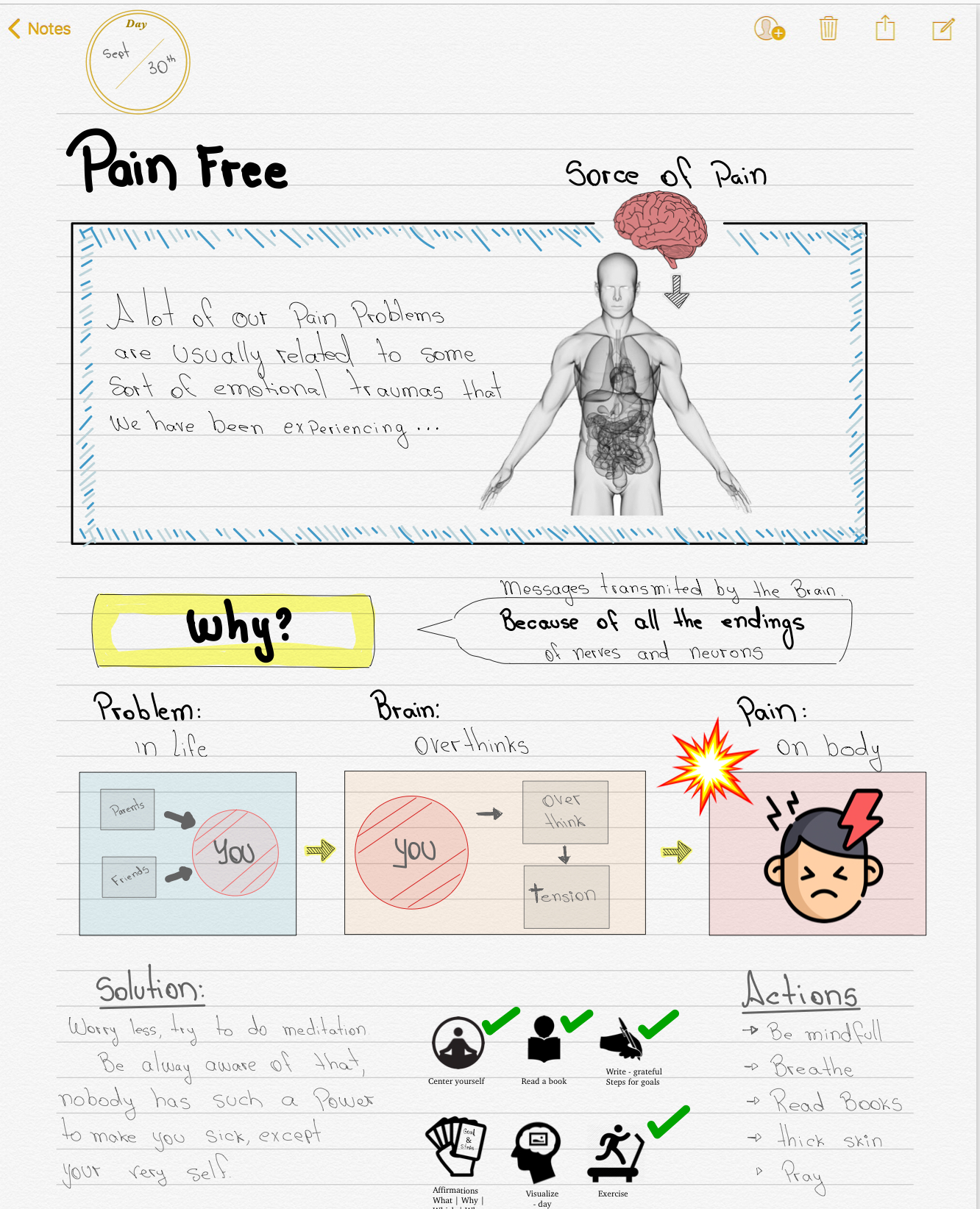
It has been a while since I started this routine to kick off my day with some reading, writing, and meditation.

I find it incredibly effective to draw and map out what I am learning.

Steps:
1. Read a couple of pages of a book
2. Gather pieces of relevant info
3. Search for inspirations (look for infographics)
4. Combine the two (Idea for infographic + “data”)

In the end, the main idea is to make it as understandable as possible, so my readers get intrigued to read the rest of the book.

Voting in Canada

Instagram post explaining to Brazilian how thee voting system works in Canada

Walking Cycle

Lorem ipsum dolor sit amet, consectetur adipiscing elit. Ut elit tellus, luctus nec ullamcorper mattis, pulvinar dapibus leo.


OC Transpo Commercial

Lorem ipsum dolor sit amet, consectetur adipiscing elit. Ut elit tellus, luctus nec ullamcorper mattis, pulvinar dapibus leo.

Let's Talk

Hire Me

We have what you are looking for – the experience you have never had before is now available for you, right here and right now. 

Or Call Me At

+204 430 3427